In my first year of Film Studies at University, one of our pieces of coursework was to create a presentation analysing any film trailer of our choice. We had to look at the use of sound, image, editing etc., and how these were presented and for what purpose. I was recently thinking back to this project and felt that doing something similar for you guys on a weekly basis would be a really good way for me to once again create a blog post that is regular and film related, and also encourage me to keep on top of recently released trailers. Obviously these post will be a lot more causal than that presentation, and with so many great trailers being released all the time, I'm sure this will be something I'll enjoy doing every Monday.
So here is my first:
Stoker
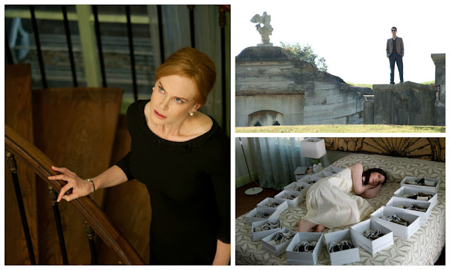
Throughout it's marketing campaign I've seen three different trailers for Stoker. The other two (also great, here and here) are probably more useful in regards to giving an insight into the plot of the film, but my mind works on a far more aesthetic level and this trailer sent me into sensory overload. Firstly, the trailer seems to have been put together with the sole incentive of putting images into the viewer's head that are going to stick. By using rapid jump-cut editing we get the multiple shots from the same sequence disjointedly cut together which, by either slowing down or speeding up the scenes, draw's your attention entirely to the imagery. It's no accident that this trailer is made up predominantly of striking images and features minimal amounts of dialogue, the focus here is entirely on the look of the film and how these disturbing events have been captured through beautiful cinematography.
The sound editing is equally as effective. I'm not sure if this is a sample from Clint Mansell's soundtrack for the film (fingers crossed) or just an appropriate track the editors dug out, but it works wonders for the trailer. Matching the cuts in the visuals to the music only emphasises the impact that has already been created visually. The way the audio track slows down towards the end of the trailer is also fantastic, easing us out of the sinister world we are being presented with. What little dialogue that has been chosen clarifies the sinister nature of the plot and the importance of family within it and by not delving into any dialogue heavy scenes the trailer keeps our attention with quick bursts of information. It also manages to display all of Matthew Goode's creepiness in one single three-word line, 'to be friends'.
I've been repeatedly impressed by the marketing for this film, and everything I've seen has only made me want to see the film more. I recently saw this trailer in the cinema with a friend, her immediate response was 'I don't have a clue what that is about, but I want to see it', so I guess it's working. If you would like to know what it's about, Stoker follows India (Mia Wasikowska) and her infatuation with her charming, but mysterious, Uncle Charlie (Goode) after he comes to live with she and her unstable mother (Nicole Kidman) after the death of her father. It is the American feature debut of Oldboy director Chan-wook Park and I think it looks incredible! I'm extremely excited to see this one.
I'd also like to just acknowledge the posters for the film, which have all been fantastic. I love that they've implemented green as the focal colour as it is so underused in film posters (unless you're a hero with green in your name, a wicked witch or grew out of a garden rather then being born). The use of it and particular shade for this series of posters is great. While I was in London last week I saw the left-hand poster all over the tube stations and every time I was completely captivated by it. Gorgeous work!


No comments :
Post a Comment